CAESAR Student Portal
How might we harness the excitement of a new quarter through Northwestern's class registration process?
Context
Instagram has recently become an addicitng, superficial, numbers-obsessed game that many people play. During our time in Silicon Valley, a team of students analyzed why this was happening – and how to fix it.
Timeline
Jan - Mar 2020
My Role
UX Researcher, UX Designer
Outcomes
2 new Instagram feature concepts, Medium article
Research
We conducted interviews on tech professionals, teens, and parents on their experiences with this tech giant in the technology hub of the country. Along with screen time reports, articles on gambling, and much more, we found these takeaways.
Interviewing employees from Apple, Facebook, startup founders
Student/teenage user interviews and testing
Reading past redesigns and articles about Instagram
People do NOT like to feel left out of things
Some features are based on slot machines – designed to pull you in
Instagram can cause episodes of depression and anxiety
Key Insights: Most students use independent web apps to plan their class schedules before registration. CAESAR has poor organization and navigation systems, as well as redundant pages that create confusion.
Prototypes
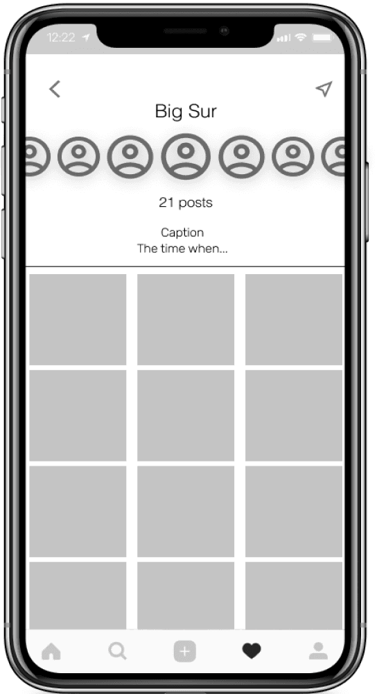
We then moved on to ideating and creating low fidelity prototypes. Since we were redesigning Instagram and not overhauling it, we decided to make many of our prototypes by overlaying features on screenshots of the current Instagram app.

User Testing
After developing some initial prototypes, we interviewed some fellow social media addicts – the 23 other cohort members in our Bay Area program. They were able to provide criticism and feedback that pushed our designs forward.
What are some feelings or behaviors you frequently have after being on social media?
Annoyed at myself
x 15
Lazy, unmotivated
x 19
Get off social media? I never do lol
x 1
Outcomes
We gathered feedback from testing and used it to iterate on our designs. We focused on three features: Close Friends, Scrapbooks, and reducing addictive mechanisms. Check out the Medium article we wrote for more insight to our process!
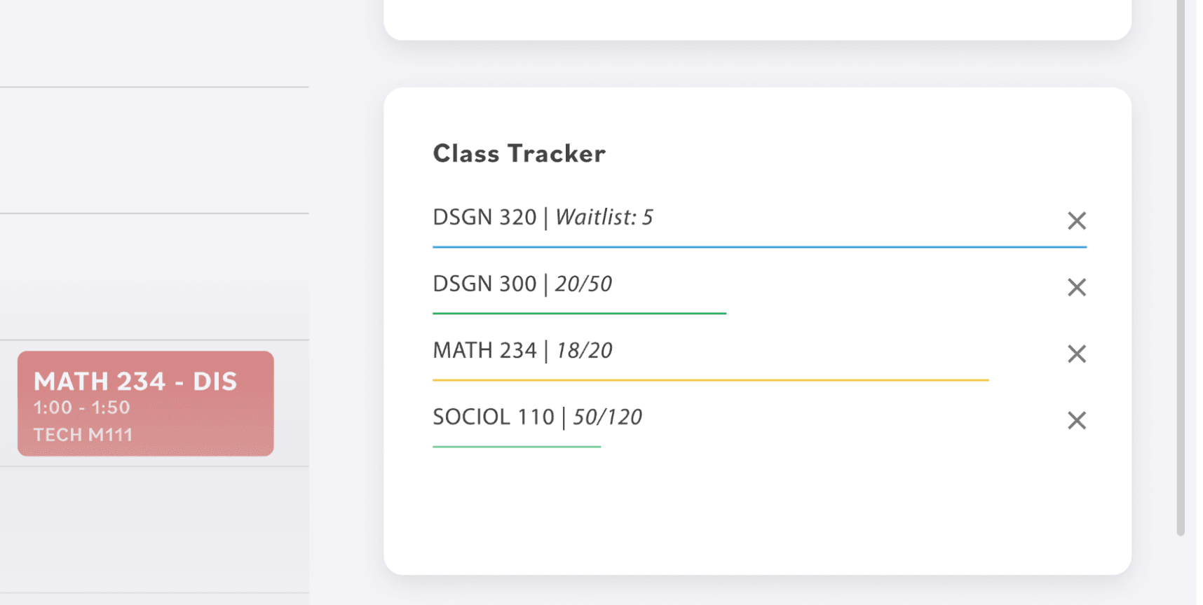
Select classes to keep tabs on and track seat availability – minimizing surprises on registration day.

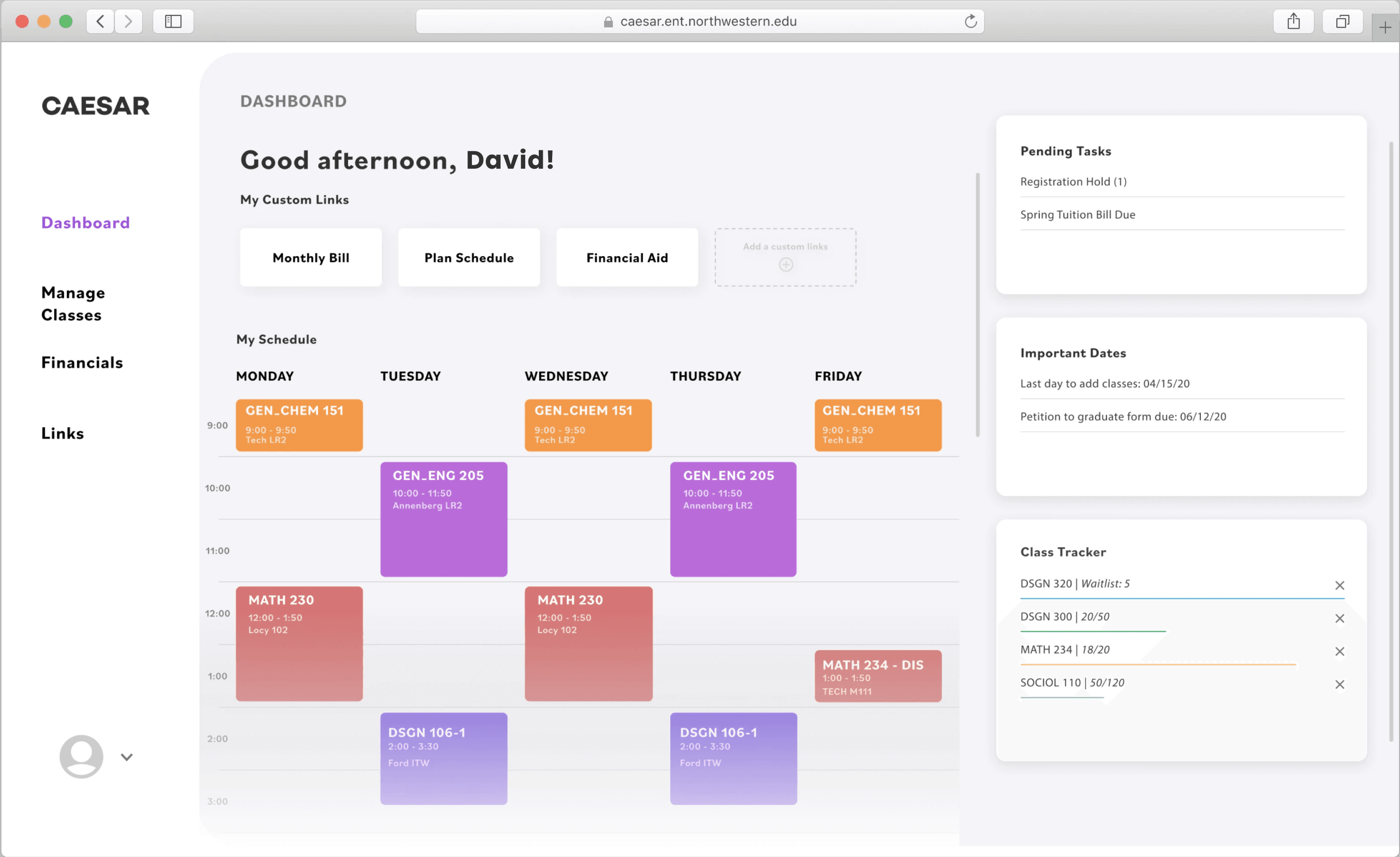
New Dashboard
Immediate access to crucial features and info
A Natural Flow
Plan, Enroll, Revise. Simulating the students' mental models
Mock Schedules
Plan multiple schedule versions to minimize risk and stress
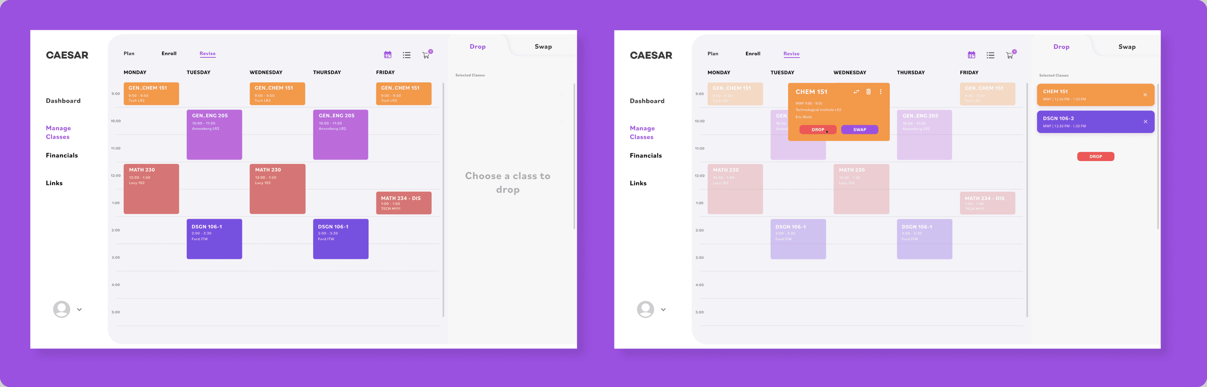
It's Okay – Revise!
If When something goes wrong, quickly tweak your schedule
Dashboard & Landing Page
I completely overhauled the existing landing page and turned it into a dashboard. The goal is to give the user immediate access to CAESAR’s most crucial information and features, thereby reducing the need to navigate through the website.
Select classes to keep tabs on and track seat availability – minimizing surprises on registration day.

Each student has different priorities and uses for CAESAR. Custom links let them access their favorite features, fast
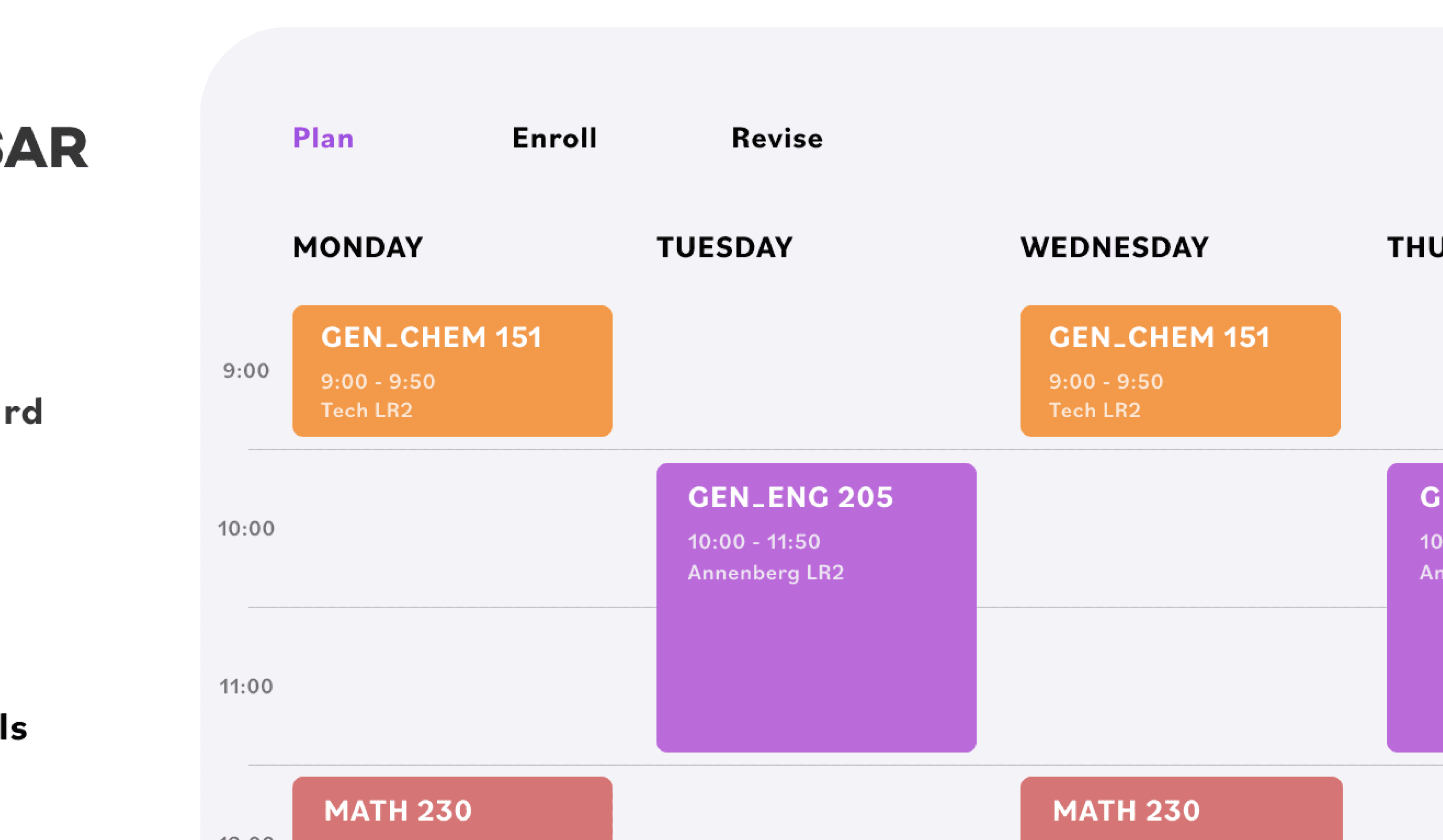
A Natural Flow: Plan, Enroll, Revise
Our new class registration flow naturally mimics the linear mental models identified during research.
We integrated a dedicated planning feature into CAESAR, eliminating the need for third-party tools.
Calendar View & Class Search
Students visualize schedules in chunks, not time slots. We used an interactive calendar as a better schedule visualization tool to help students understand and plan their schedules.
We improved the class search feature displaying class search results before individual sections, in order to organize the flow of information.
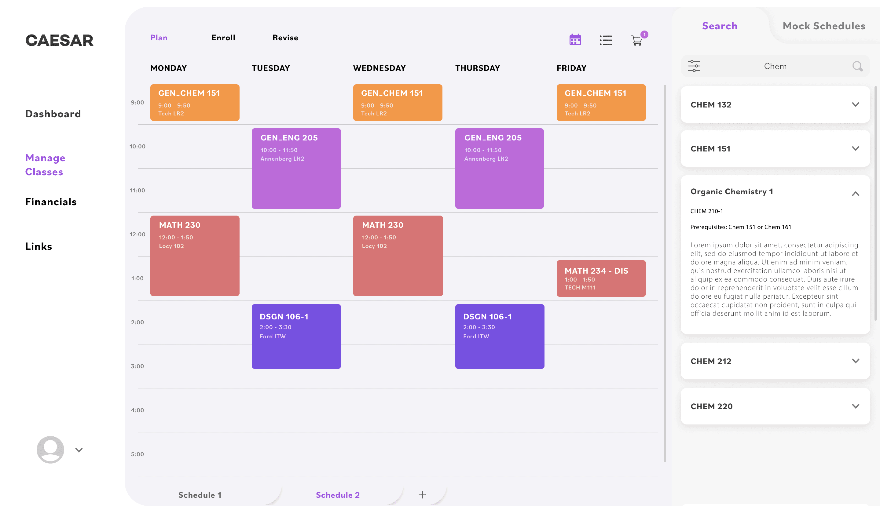

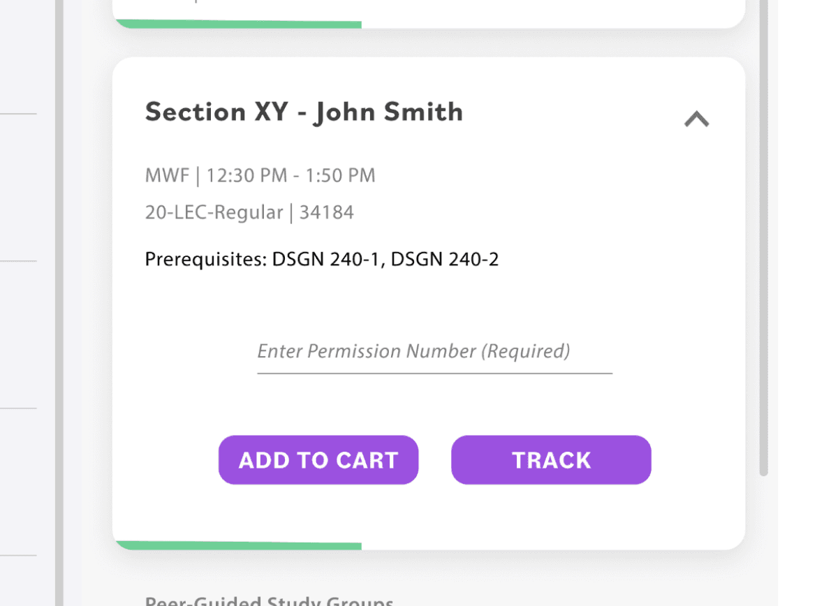
Different sections (time offerings) are displayed after selecting a class. A status bar indicates whether a class has many, few, or no seats open.
Users can add a class to a mock schedule, add it to the shopping cart, or track the class enrollment
Special enrollment requirements (e.g. Permission Numbers) are displayed here so a student is fully aware of their eligibility before adding a class to their schedules.
Mock Schedules
Adding a mock schedule directly to a user’s shopping cart eases the transition from planning to enrolling.
An undo option – inspired by Jef Raskin’s principles of HCI – appears after a schedule is added to the cart. The alternative, a confirmation box, is ineffective as it fades out of a user’s locus of attention and causes habit formation to harm the user.

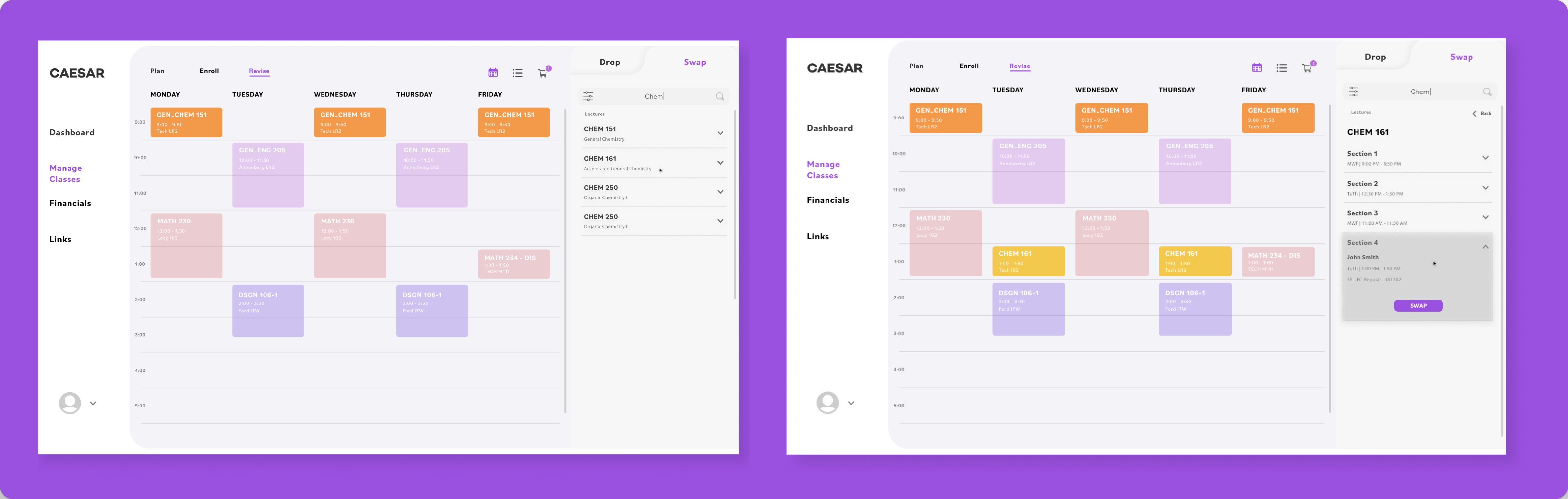
Drop, Swap, Enroll
When making changes to a class schedule, delays always risk a student’s preferred class filling up. Being able to make quick changes to a student’s current schedule is important, and we made tweaks to the existing features to facilitate this process.
Reflection
I was definitely passionate about reworking a tool that is so instrumental to a Northwestern student's academic journey. Working with a great friend also reminded me of the importance of empathizing not only with users but also with fellow teammates and designers.
Pat on the Back
Executing the human-centered design process and reiterating on designs based on feedback
Lessons Learned
Leading a product design and setting timelines for checkpoints in the project process
Outcomes
Presented work to relevant NU faculty to explore future implementation and use
Project
Project
Designed and developed by David Yoon. All rights reserved.